For many beginners, stock charts look more complicated than they really are. At first glance, they seem full of random lines, bars, colors, and movements that only experienced traders understand. This can make the stock market feel intimidating, especially when you are just starting to learn the basics of investing.
The truth is that reading a stock chart does not have to be difficult. You do not need to become an expert in technical analysis or learn advanced trading patterns on your first day. What matters most at the beginning is learning how to understand the basic information a chart is showing.
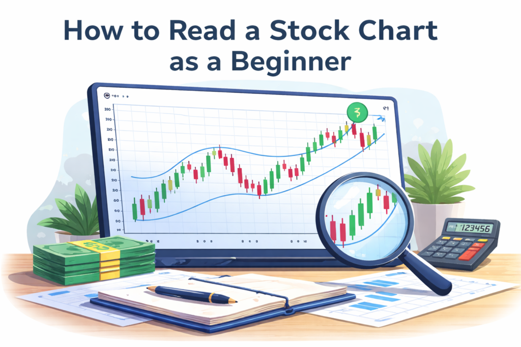
A stock chart is simply a visual way of showing how the price of a stock changes over time. Once you understand that, everything becomes much easier. It helps you see whether a stock has been rising, falling, or moving sideways. It also helps you understand how price movement is displayed and why investors pay attention to it.
In this guide, you will learn how to read a stock chart as a beginner, what the main parts mean, and what you should focus on without getting overwhelmed.
What a Stock Chart Actually Shows
At its core, a stock chart shows the price of a stock over a period of time. That is the main purpose.
The horizontal part of the chart usually represents time. Depending on the platform, this might show one day, one week, one month, one year, or even several years. The vertical part usually represents price, showing how much the stock was worth at different moments.
When you combine those two things, you get a visual history of the stock’s movement. If the chart goes upward, the stock price has increased over that time period. If it goes downward, the stock price has fallen. If it moves sideways, the stock has stayed relatively stable.
That is the basic idea. A chart is simply a way to make price movement easier to understand at a glance.
Beginners often assume charts are mainly for short-term traders, but they can also be useful for long-term investors. Even if you are not trading actively, learning how to read a chart helps you better understand what you are looking at when researching a stock.
The Main Parts of a Stock Chart
Once you open a stock chart, there are a few basic elements you should pay attention to first.
The first is the time period. Most chart platforms let you choose how much history you want to see. A one-day chart will look very different from a one-year chart. This matters because short-term movement can look dramatic, while longer time periods often show a clearer overall trend.
The second is the price axis. This shows how much the stock costs. As the chart moves higher or lower, it reflects changes in price.
The third is the trend. This is simply the general direction of the stock over time. A chart that moves upward over a long period suggests growth. A chart that falls over time shows decline. A chart that stays mostly flat suggests little overall change.
The fourth is the chart type. Some charts use a simple line. Others use candlesticks or bars. For beginners, line charts are usually easier to understand at first, while candlestick charts may take a little more time to learn.
If you focus on these four things first, most stock charts will already feel much less confusing.

Line Charts vs Candlestick Charts
One reason beginners feel overwhelmed is that charts can be displayed in different styles.
A line chart is the simplest version. It connects price points with one continuous line. This is easy to read and is often enough for beginners who just want to understand the general direction of a stock.
A candlestick chart shows more detail. Instead of one simple line, it uses candle-shaped bars to display how the price moved during a certain time period. Each candlestick can show the opening price, the closing price, the highest price, and the lowest price during that period.
For someone just getting started, candlestick charts can look complicated at first. But you do not need to master them immediately. It is perfectly fine to begin with line charts and then gradually learn what candlesticks mean later.
The main goal at the beginning is not reading every small detail. It is understanding the broad movement of price and becoming comfortable with how charts present information.
What Green and Red Usually Mean
On many platforms, stock charts use colors to make movement easier to understand.
Typically, green suggests price strength or upward movement, while red suggests weakness or downward movement. In candlestick charts, a green candle often means the price closed higher than it opened during that period. A red candle often means the opposite.
This color system helps users scan the chart more quickly. Even without understanding every detail, you can often get a quick impression of whether the stock has recently moved up or down.
However, beginners should not focus too much on one or two red or green candles. A stock chart should be read in context. One red day does not automatically mean something is wrong, and one green day does not automatically mean something is great.
It is the wider picture that matters most.
Why Time Frame Matters So Much
A stock chart can tell very different stories depending on the time frame you select.
For example, a stock may look weak on a one-day chart because it dropped slightly today. But on a one-year chart, it may still be strongly upward overall. On the other hand, a stock may look exciting on a one-week chart but still be performing badly over a longer period.
This is why beginners should be careful not to judge a stock too quickly based on a very short time frame. Short-term charts often contain more noise. They show small movements that may not matter much in the bigger picture.
Longer time frames are usually more helpful for beginners, especially if the goal is to understand trends rather than trade short-term moves. Looking at one month, six months, or one year often gives a more useful perspective than focusing only on what happened today.
A chart becomes much easier to understand when you remember to ask: over what period am I looking at this stock?
Support, Resistance, and Trend Direction
As you become more comfortable with charts, you may hear terms like support, resistance, and trend.
A trend is simply the general direction of the price. If the stock keeps moving higher over time, it is in an upward trend. If it keeps moving lower, it is in a downward trend.
Support usually refers to a price area where the stock tends to stop falling and find buyers. Resistance refers to an area where the stock often struggles to move higher because selling pressure appears.
Beginners do not need to become experts in these concepts immediately, but it helps to know the words. These ideas are often used when people talk about chart movement and investor behavior.
Still, it is important not to overcomplicate things. At the beginner level, just understanding whether a stock has generally been rising, falling, or moving sideways is already enough to be useful.
What Charts Can Tell You — and What They Cannot
A stock chart can show you what the price has done. It can show trends, volatility, and how the stock has behaved over time.
But a chart cannot tell you everything.
It does not fully explain why a company is good or bad. It does not tell you whether the business has strong finances, good management, or long-term potential. A chart is useful, but it is only one part of understanding an investment.
This is where many beginners make mistakes. They start thinking a chart alone can tell them what to buy. In reality, charts are best used as one piece of information, not the entire decision.
A stock can have a beautiful chart and still be a weak business. A good company can also have a temporary bad-looking chart. That is why reading charts should support your understanding, not replace it.
What Beginners Should Focus On First
If you are new to stock charts, keep your attention on the basics.
First, understand the time frame you are looking at. Second, identify whether the stock has generally gone up, down, or sideways. Third, notice whether the movement looks stable or very volatile. Fourth, do not panic over small short-term changes.
That is already enough to build a useful foundation.
You do not need to memorize advanced patterns, trading signals, or complex strategies at the beginning. Many beginners waste time trying to sound advanced before they understand the basics. A simple understanding used consistently is much more valuable.
If you can look at a chart and understand what period it covers, what direction the stock has moved, and whether the movement seems calm or volatile, you are already making progress.
Conclusion
Reading a stock chart as a beginner is much simpler than it first appears. A chart is just a visual way of showing how a stock’s price changes over time. Once you understand the role of time, price, trend, and chart type, most of the confusion starts to disappear.
You do not need to master every detail right away. The most important thing is learning how to read the basic information clearly and calmly. Over time, your confidence will grow, and charts will begin to look much more familiar.
For beginners, the goal is not to become an expert overnight. It is to understand enough to feel comfortable, avoid confusion, and make better investing decisions step by step.